A Bittersweet Life: A New Look to Film Promotion
 Usually there is a traditional layout when it comes to film promotional websites. There are bells and whistles in the form of flash animations and beautiful graphics but most film sites are essentially the same. All of them have a synopsis, a trailer, still photos and character reviews. But how many have a fight clip where the only way to view it is to anticipate the moves of the main character using your computer's arrow keys? The site for the Korean film, A Bittersweet Life, has exactly that. This 2005 Webby Award nominee is upping the ante for film promotional websites. Through several facets such as the site’s interactive and visual design, it is adding new depth to the field. Following a format like that seen in other media genres (music, art, television) A Bittersweet Life's purpose is not simply to inform, entertain, or to persuade. Instead, its purpose is to sell a product (the movie), and the innovative qualties of this site enhance and help to do this. Its graphics, narration, and games will have people rethinking what to expect from their films.
The first area in which A Bittersweet Life has enhanced its appeal is through the site’s unique structure and the way one navigates within it. According to the International Academy of Digital Arts and Sciences, a good website “allows you to form a mental model of the information provided, where to find things, and what to expect when you click.” A Bittersweet Life, however, does not follow this example. While most movie websites are made in a grid like pattern unabling users to form this "mental model", A Bittersweet Life is made to be read linearly. The first page gives the user two links titled, “A
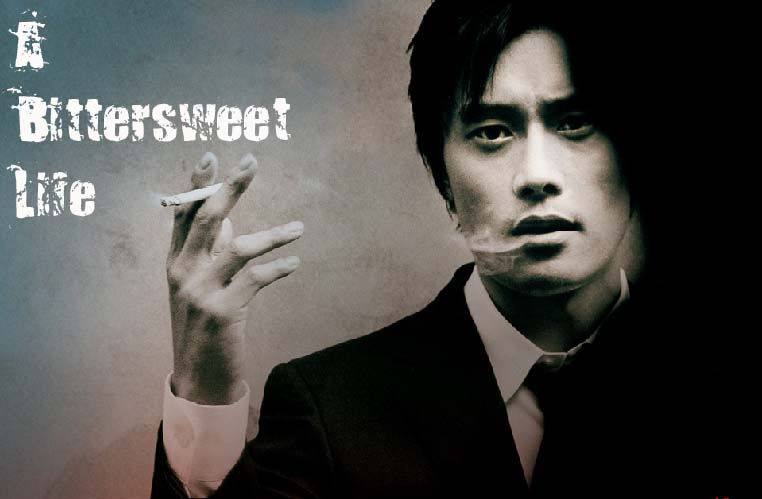
 Sweet Life” and “Irreversible.” By clicking on either of these choices the page leads one through the plot of the movie. Each page reveals more of the story through games, with the whole site working like a giant complex preview for the film. This distinctive layout has the advantage of heightening the user's emotions. Take the first page for example (image above). The main character, Sun-Woo, sits in a chair with a rather heavy expression on his face. On either side are the two links. Even though it is the visitor that decides which link to click, the structure and placement of the links gives the illusion that the two choices are weighing on Sun-Woo himself. This adds drama and anticipation to the visitor’s choice, as it stresses the importance of the choice to the story. If these links had been placed elsewhere, say at the top of the page, they would not have the same effect. Just the same, by creating this dramatic effect, it seems fitting, even necessary, not to know where these links will take you. That way, the anticipation for each new page will mirror that of a movie.
  For some, this layout can be frustrating. The whole site was made on Macromedia Flash Player so individual pages do not have individual URLs. In order to return to a particular page, one has to go through the entire site till they reach what they want. The Web Style Guide reflects on this flaw stating that sites can have, "complex tables, large graphics, and technologies such as Flash [as A Bittersweet Life does], but these pages need to come with an equivalent, accessible version." Which this site does not. A Bittersweet Life might also seem extremely time consuming to someone searching for a particular, like a still photo or a trailer. However, this site is not without the film essentials. Along the bottom of the player, out of the way of the main page is a tool bar. This bar takes the visitor away from the linear structure, to a more familiar grid like approach to the film. It is here that the only real text about the movie can be read. Also found are character breakdowns, reviews, and other useful things that one would expect at a movie site. But these features are pushed to the side in a display of visual hierarchy. The rather isolated position of the tool bar compared to the overwhelmingly large space reserved for the main page suggests that these tools are more of a formality. However, it is a smart decision to open up the web site to be more accessible to the different needs of people. These pages are rich in text, and anyone who cannot sit through the games can find refuge in them. The director's page is particularly enlightening, as it not only has a biography about the man, but it goes into his vision and influence of noir in a DVD extra-like fashion. But, as should be expected with translation, there are several spelling and grammar mistakes within the text that must be overlooked to truly enjoy the information the pages provide. The pages of the toolbar, like the rest of the site, do not have individual URLs making these pages only slightly less frustrating to retrieve.
 The second way A Bittersweet Life has added depth to their page is through the wonderful use of visual design. IADAS states that good visual design will be “more than just a pretty homepage “ and that it “communicates a visual experience and may even take your breath away.” The key words here are “visual experience", as A Bittersweet Life takes this idea seriously, providing not only stunning images, but images that help to define the film itself. When looking at the previous example, the image at a deeper glance is filled with information that provides insight into the story. Examining Sun-Woo once again, we find in front of him a gun and a photo. If we divide this screen in half, the side with the gun has a completely different appearance than the side with the photo. The side of the gun looks like a dingy monochrome bathroom (complete with a body on the floor), while the other looks tidy(though not elegant) and is filled with much more vibrant color. It might not be a surprise then that this imagery is connected to the story behind each of these links. The link “A Sweet Life” reveals that Sun-Woo is assigned to spy on his boss's young girlfriend, hence the photo and the large display of the surveillance equipment. “Irreversible” reveals the group of “ex-friends-turned-rivals” whom Sun-Woo has to fend off to stay alive. The gun, the dingy state of the room, plus the body in the corner all have meaning pertaining to that part of the story. Almost every page of the site is packed with visual signals such as this, and accorrding to the Web Style Guide, "highly graphical pages risk disappointing the user by offering a poor balance of visual sensation, text information, and interactive hypermedia links." Image quality in A Bittersweet Life is so great that slower computers have a hard time loading the pages. Every one is jammed with information, so it is highly likely that much of it will be overlooked as viewers search for the balance mentioned earlier.
The sound design of the site adds depth through its audio cues. A Bittersweet Life works beyond the definition of audio in the Web Style Guide which states that "audio simply delivers information", and completely beyond the IADAS (which never mentions sound). The music of the site works well to heighten emotion on every page. It creates tension in situations where visuals alone would not have sufficed. For example, a particular page requires the user to click on swirling black boxes to reveal the movements of Sun-Woo in a hotel. It is not a particular exciting game, yet the intensity of the activity is heightened by the audio. Each time the visitor to the site clicks on a one of the swirling boxes, it makes a sound best described as a large "clunk" that lets the player know there is no turning back. The audio is what foreshadows the conflict of the next page, similar to a movie preview that uses sound to draw viewers into the plot of the movie. However, sometimes the site's use of audio can be jarring. When first directed to the page the viewer is prompted to pick between the Korean or English site. Right after choosing, a very loud gunshot rings out and a gun is pointed out towards the viewer with it barrel smoking. This loud effect is such a shocking difference from the serene and quiet homepage that it might send people running (or clicking) to get away from the source.

The biggest feature of A Bittersweet Life that sets it apart from other film sites is its interactive design. Instead of merely reading the synopsis, this site allows people to become part of the story. The Web Style Guide states that entertainment sites such as this must grab audience attention instantly, since the audience in general is less focused than others and will simply “hop away somewhere else.” And grab this site does. As mentioned before, the site presents the story in a linear fashion. What was not said is that this linear story is actually an interactive game. By completing each mini-game, more of the plot and the character’s traits are revealed. One of the more revealing and thoughtful interactions, is between Sun-Woo and his boss’s young girlfriend. When Woo is assigned to surveillance her activities, the site directs viewers to a page with a large Russian Matryoshka doll in the center. Then, it prompts them to start removing the layers of the doll. Each time a new layer is revealed, the life of the young woman is also revealed. These games help to intensify emotion much the same as the structure and sound design of the site.
These games turn a spectator in to a participant in the story. In another game, Sun-Woo has been threatened. He must apologize or else, he is told, something horrible will happen to him. The game is to spell out the words "I'm sorry" before the time runs out. The photo shows how far one can go. There is no second "r". A video clip streams to the side of the game. It shows the enemy grabbing a knife and preparing Woo’s punishment. The next few minutes play on the nerves while figuring out how to apoligise. It is at the last second that the site reveals what should be spelt instead (“get lost”), finally releasing the tension the game had caused. This part of the plot is extremely effective as a game, since it allows for the connection of the emotion it caused to the movie itself. If this scene had not been presented in the same way, it would not have been so unnerving.
Tideland is another site nominated for a Webby that also has an interactive design. Yet when compared to A Bittersweet Life, the two sites are very different. Tideland's interactivity in comparison is restricted. The site is given in a grid layout, with a central page that can navigate to all the necessary information. Tideland's interactivity lies in the method that one moves through this central page. Instead of simply listing the links, the site has turned the central page into a first person maze. The visitor is the one that moves themselves through the page to seek out the different pages. But once they navigate away from the central page, this interactivity is gone. In A Bittersweet Life the interactivity is an everlasting presence. Each page (besides the toolbar) provides a different way for everyone to relate to the movie in a personal and connected way. However, this level of interactivity comes with major drawbacks. "You risk losing your audience if you require them to jump through hoops to view your content" according to the Web Style Guide. Due to the size of the images and the complexity of the games, only the fastest of computers can view the site properly without compromising its functionality. Otherwise, more time is spent waiting for everything to load rather than playing the games. Some users will be jumping through hoops. Another flaw in the site's design is that so much effort was placed in making the games look great that some of the transitional effects are lacking. With better transitional graphics and smaller game and image sizes, this site would be even more enjoyable than it already is.
The last category in which the Webby Awards are judged is overall experience. They explain that "one has probably had a good overall experience if (s)he comes back regularly, places a bookmark... or stays for a while intrigued." Beyond all the innovative use of interactivity, rich images, thoughtful structure, and flaws; A Bittersweet Life is a site where one should plan to stay for hours. Many web-goers might object to the violent content of the film. But while some of these people can not be solaced, the imagery on the site is always tasteful and never overly or unnecessarily groteseque. This hints that the movie will treat this violence in the same way. In the end, A Bittersweet Life uses all of its qualities to provide guests with enough information to send them into the theater. Hopefully there will be enough seats!
posted by Jordan @ 11:12 AM
0 comments
![]()
![]()

